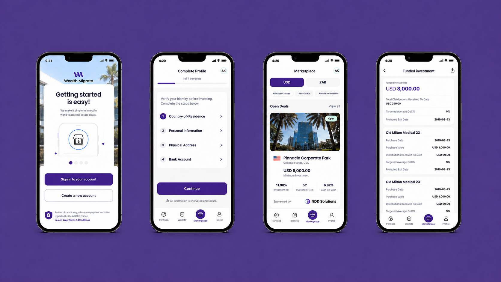
Summary
Mission
Redesign Wealth Migrate’s global property-investment experience so customers could move from sign-up to their first investment with greater clarity and confidence.
Challenge
The platform attracted interest, but users were abandoning the journey before investing. Lengthy verification, unclear requirements, fragmented funding steps and weak risk communication made an already complex financial decision feel harder than it needed to be.
My contribution
As the designer, I shaped the end-to-end experience, from research synthesis and product strategy through user flows, prototyping, interface design and the component system, working closely with founders, product, compliance and engineering.
Impact
Post-launch results reported by the team showed that simplifying the journey improved progression and helped convert more customer interest into investment activity.
Starting with Research
Before redesigning the experience, I needed to understand why users were creating accounts but failing to progress to their first investment.
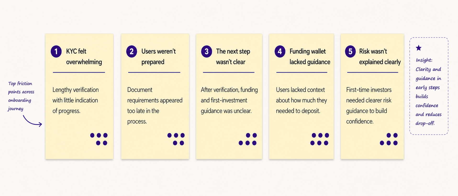
By reviewing the existing journey, speaking with users and stakeholders, and analysing competing investment platforms, I identified several points where friction and uncertainty were breaking user confidence.
Understanding where users were dropping off
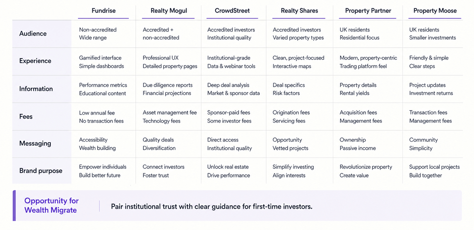
Competitor Analysis
I analysed key competitors to understand how they approached the investment journey, identify market patterns and uncover opportunities where Wealth Migrate could create a clearer, more differentiated experience.
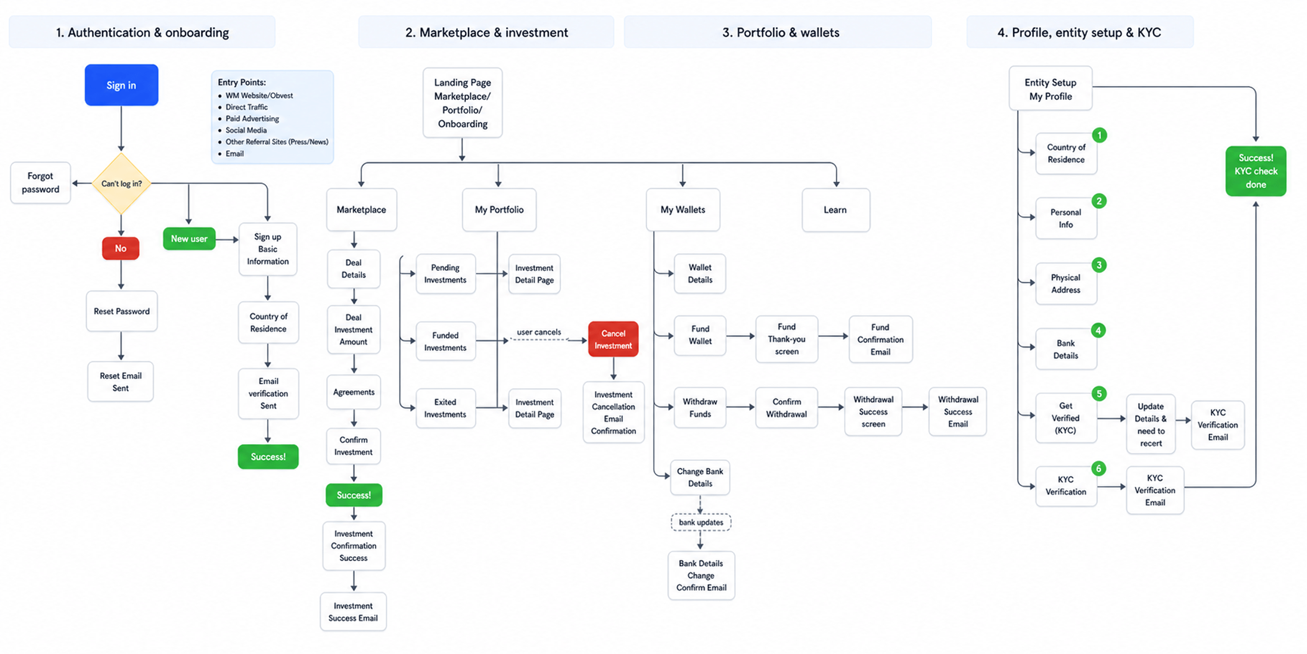
Exploring the Flow
With the key opportunities defined, I mapped the app’s structure and core user flows across different user roles. Aligning on these journeys early with product and development helped surface gaps, clarify requirements and reduce complexity before moving into design.
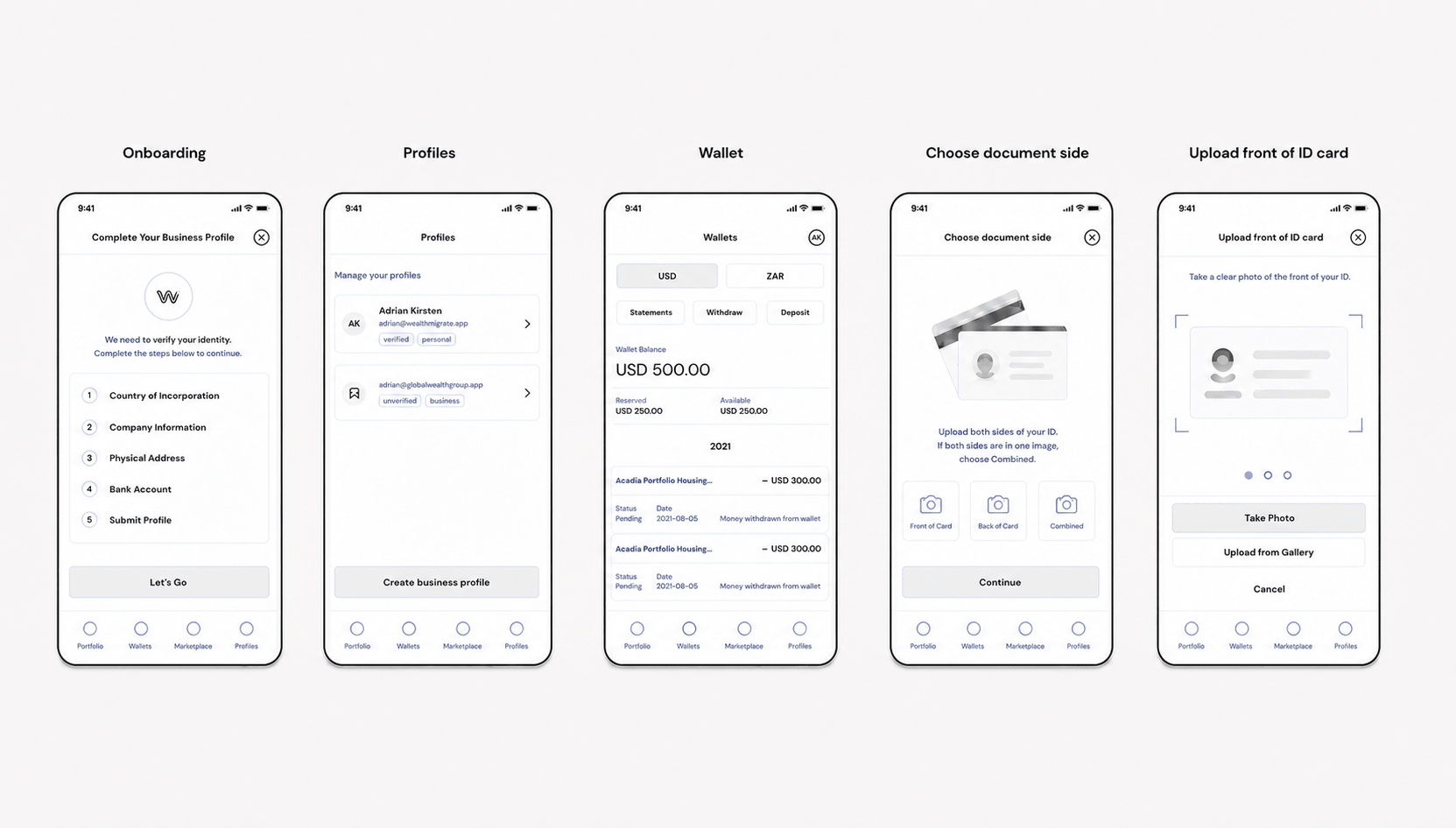
Low-fidelity wireframes
I translated the core user flow into low-fidelity wireframes to explore each screen, test the hierarchy and refine key interactions before moving into visual design.
Usability Testing
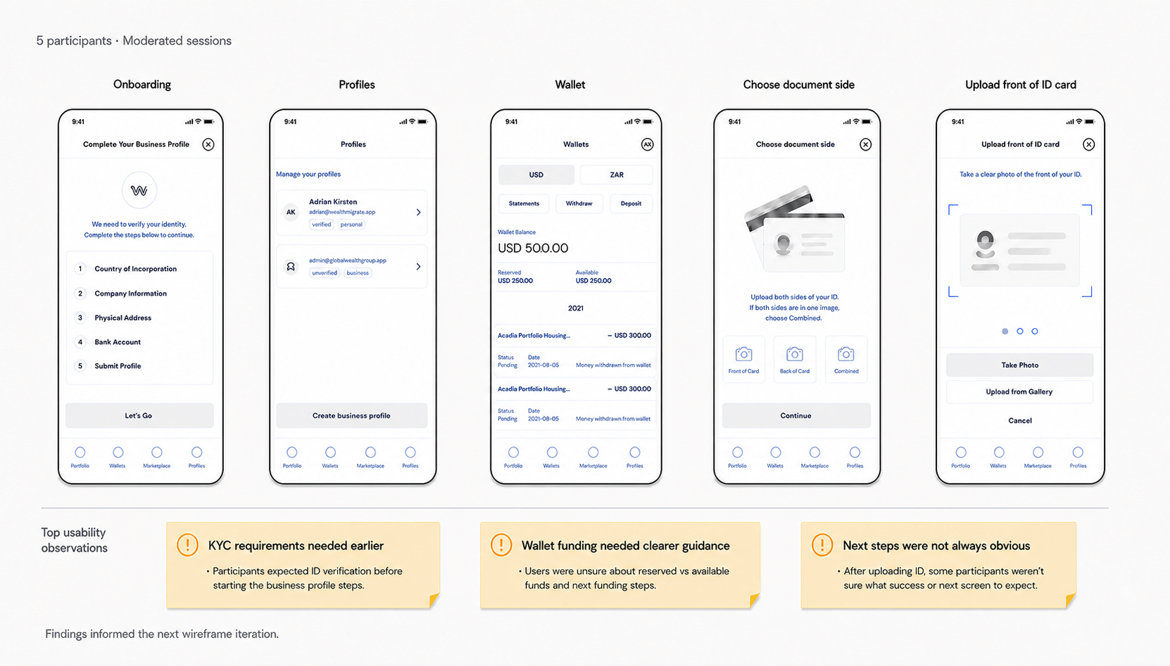
A interactive low-fidelity prototype was created to test the platform’s core journeys with representative users before progressing to visual design.
Validating the core experience
- Complete onboarding and KYC verification
Assessed whether users understood the requirements and could complete verification confidently. - Fund the investment wallet
Tested whether users could select a funding method and successfully add funds. - Make a first investment
Evaluated whether users could review an opportunity and complete an investment without assistance.
Ui Designs
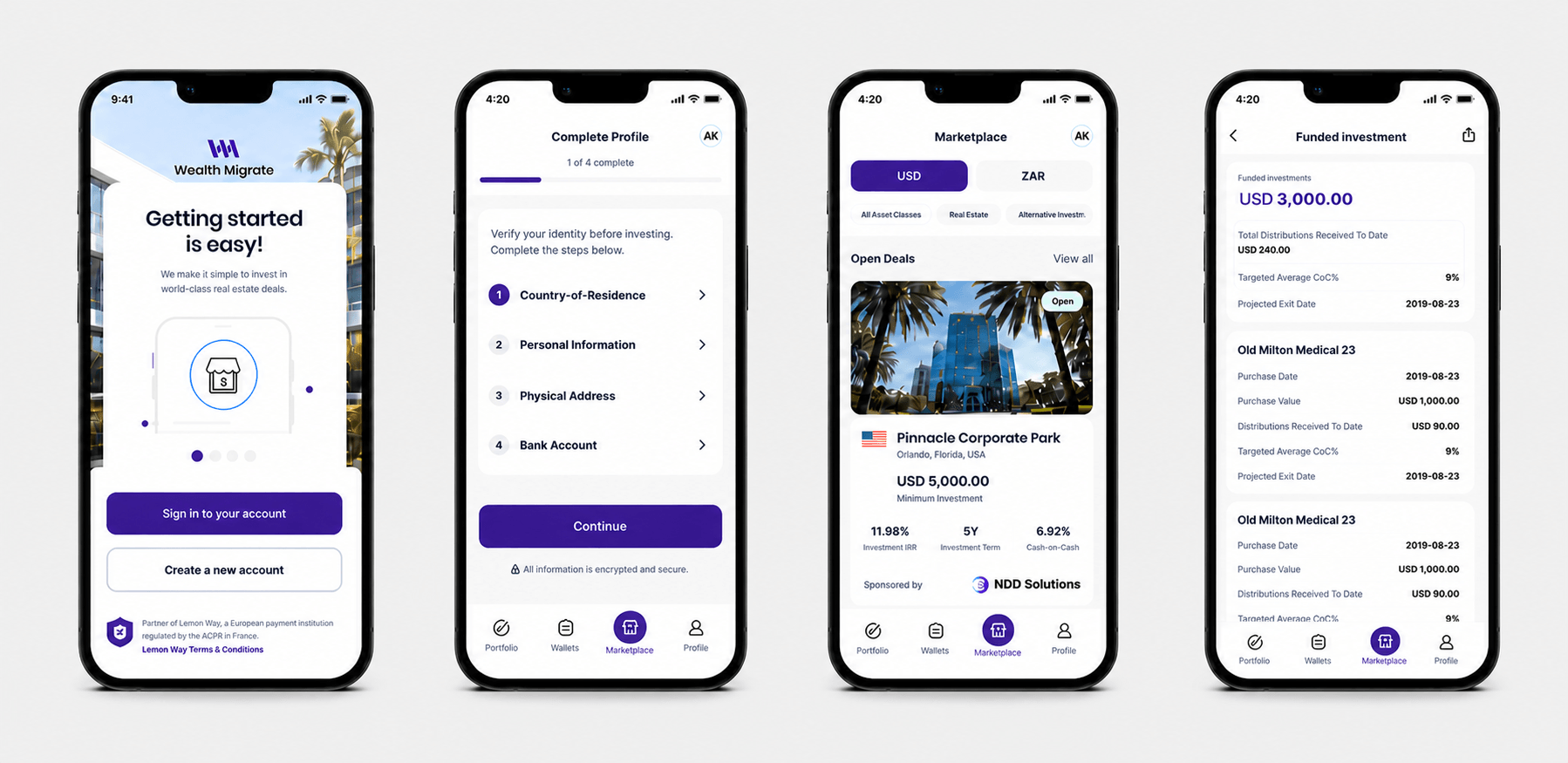
With the core flows validated, I translated the wireframes into a high-fidelity, development-ready experience. I established a consistent visual system across typography, colour, components and interaction patterns, while staying aligned with the Wealth Migrate brand.
For an investment platform, clarity and trust were critical, so I focused on simplifying complex financial information, creating clear hierarchy and helping users make informed investment decisions with confidence.
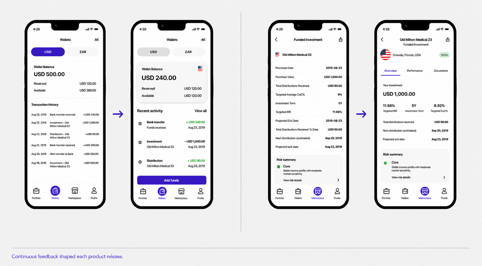
Post-Launch Iteration
Working across product, compliance and engineering
Complex fintech journeys cannot be solved by design in isolation. I worked with compliance to clarify regulatory requirements, with product to sequence the experience around customer value, and with engineering to define reusable states and components that were practical to ship.
Early alignment around flows and system rules reduced late-stage ambiguity and helped the team make decisions using a shared model of the customer journey.
Reflection, Designing confidence, not just screens
The most important shift was recognising that customers did not need less financial information, they needed a clearer path through it. Simplifying the experience meant reducing the work of interpretation while preserving the detail required for an informed decision.
This project reinforced my approach to complex products: align the system around the customer’s decision, make uncertainty visible, and treat trust as something the experience must earn at every step.